Archive
2022
KubaParis
Dicke Haut

Location
DOCK 20Date
02.06 –09.09.2022Curator
Anne ZühlkePhotography
Miro KuzmanovicSubheadline
With her first institutional solo show at DOCK 20, installation artist Luka Jana Berchtold ventures into the raw realms of ambivalent emotions and complex forms of human communication. With her multi-layered artistic vocabulary, she takes visitors on a trip through social and individual shallows.Text
I Material
For the exhibition "Dicke Haut" Luka Jana Berchtold has produced six works and a series of works made of different materials. The artist uses iron, wax, wooden shingles, ceramics, pewter, leather, plaster, and sand for mainly abstract works that exhibit their material properties and surfaces with varying intensity.
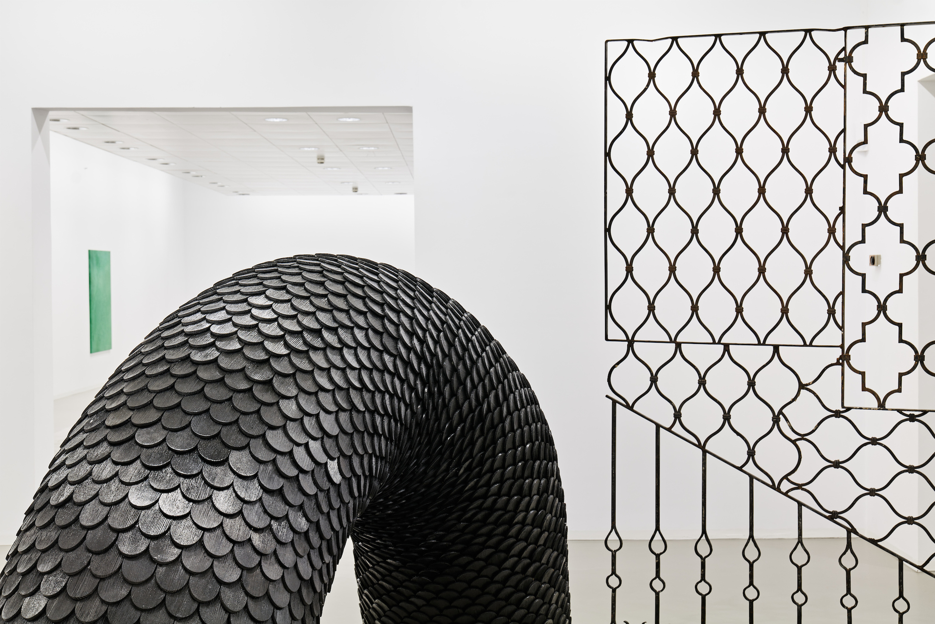
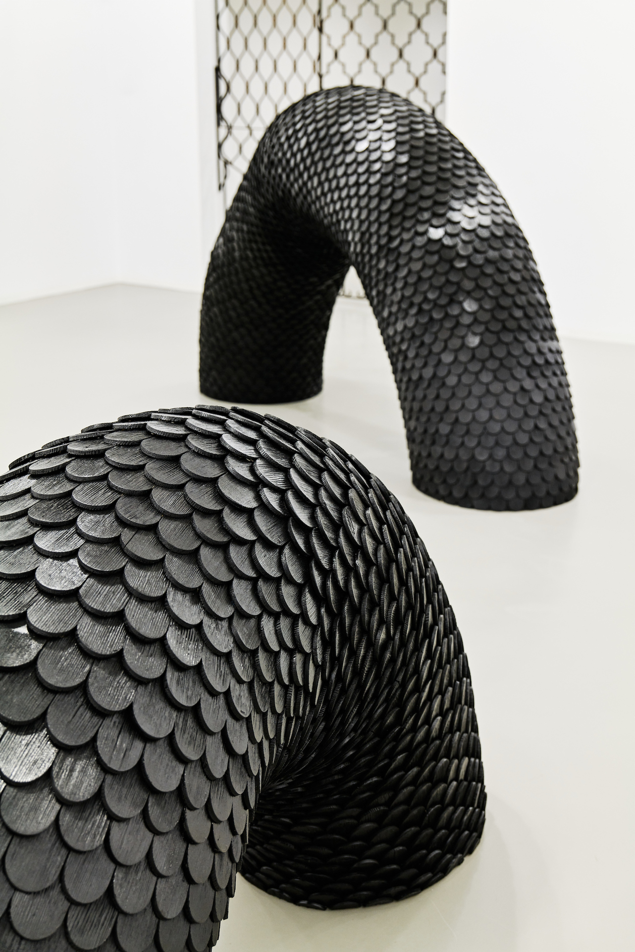
For "untitled creep", a room-sized sculpture that evokes associations with a serpentine animal, the artist alienates wooden shingles traditionally used to clad the facades of homes. In "untitled creep", the shingles become the scaly garb of the two half-arches that seem to grow out of the ground. Berchtold uses the wooden material - as intended by the purpose of the shingles - to encase the creep, but its darkly painted shell has shed the naturalness of the wooden shingles. The light from the white cube lends a reflective, glossy surface inscribed in an aesthetic of shine. It is closer to the dark cell phone display than to the natural object that reveals patina or irregularities. (1)
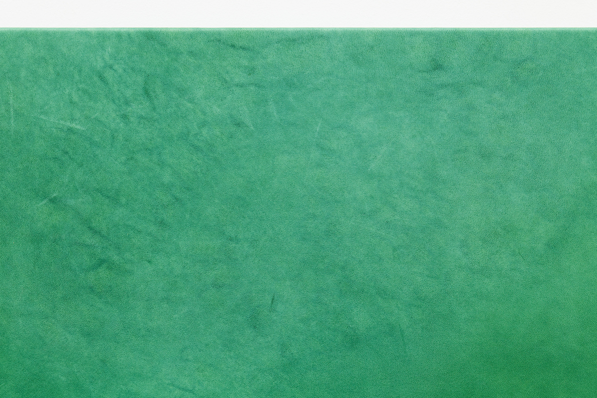
In contrast, traces of aging and time are inscribed in the materials of "bouncer", a large-scale metal grid, as well as in the leather of the work "untitled (grün I)", which is in the tradition of monochrome, modernist painting. (2) Both the wrought-iron grids and the soft cowhide show traces of their origins: rust is visible on the iron, and the green-dyed animal skin shows wrinkles and past patterns of movement. It is not the artist's hand that has left the traces in the monochrome painting. Rather, the leather has its living past inscribed in it. (3)
II Consistence
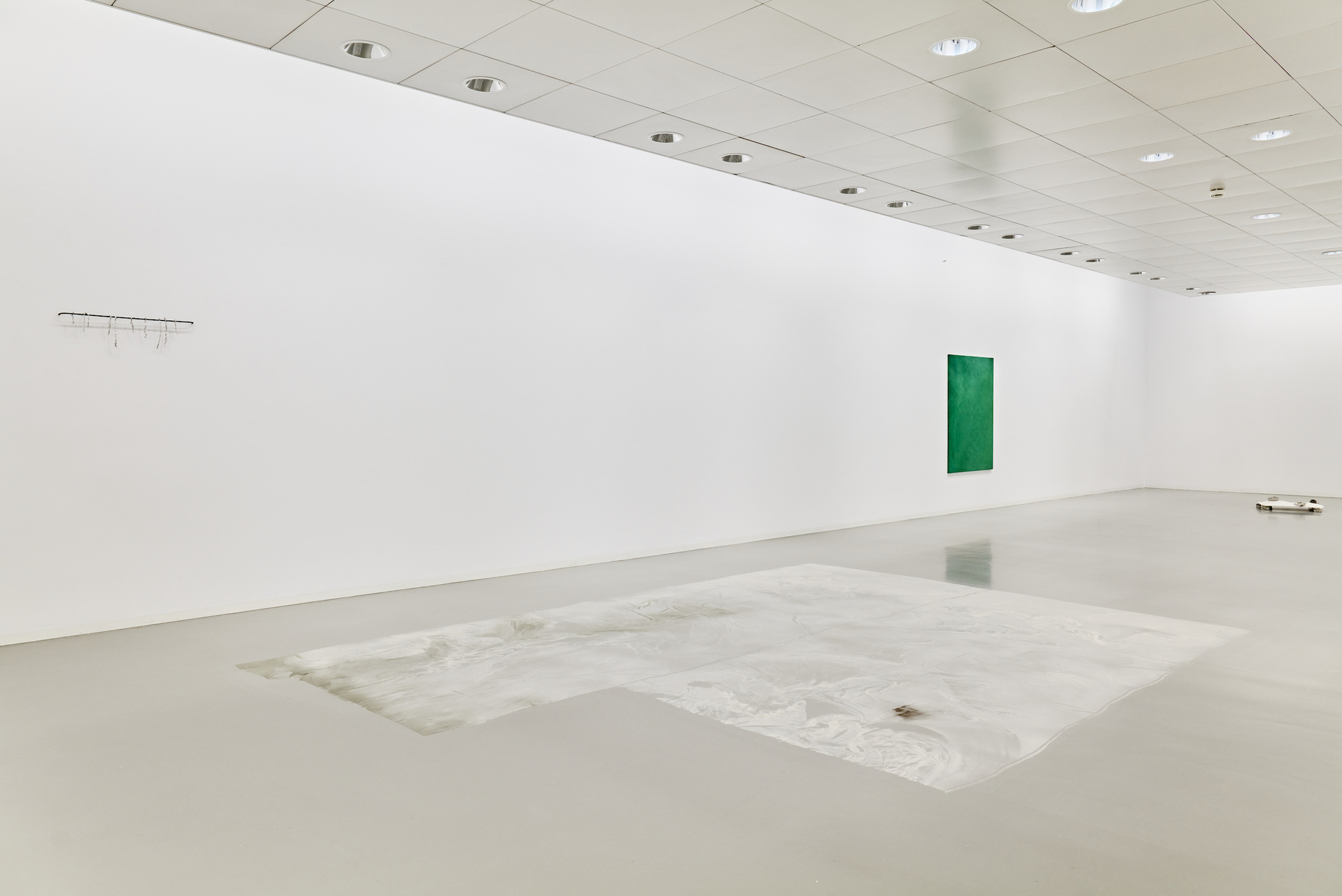
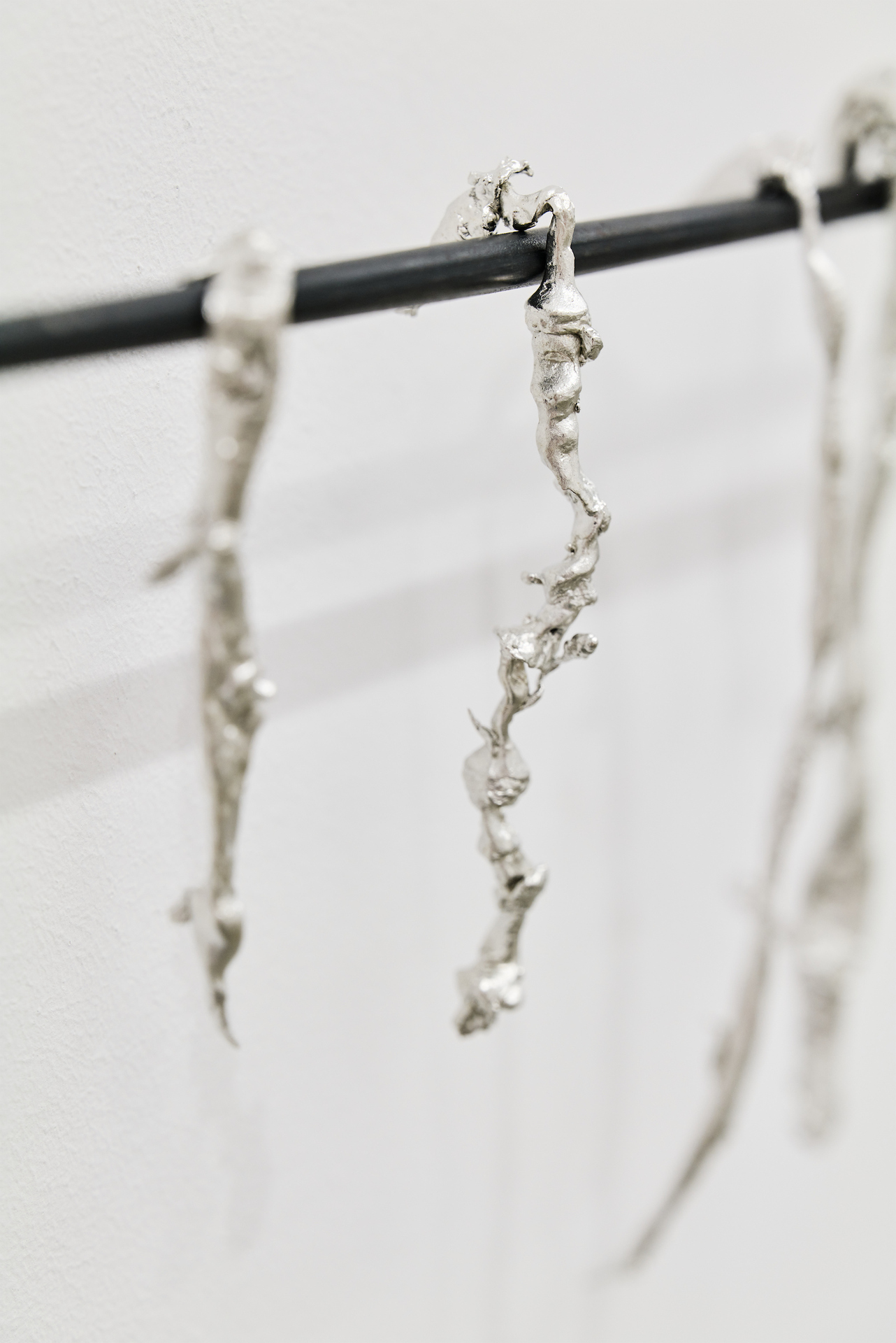
Liquid becomes hard. Soft becomes solid. In the installation "tears of tin (dry a.f.)" the tears are dried, hardened, fixed. Berchtold has placed ten elongated tin drops in sequence on a towel rack. Already presented in a similar form in the installation "floor work" (2021), the tears are, however, more coarsely worked and larger. They emphasize verticality, the moment of flowing down. Nevertheless, the tears are 'dry as fuck' - as the title of the work points out. They have transformed their initial liquid form through the hardening process of their material. On a semantic level, the tears are strung together like memories on a towel rack. Time has passed since they flowed, their relevance lost.
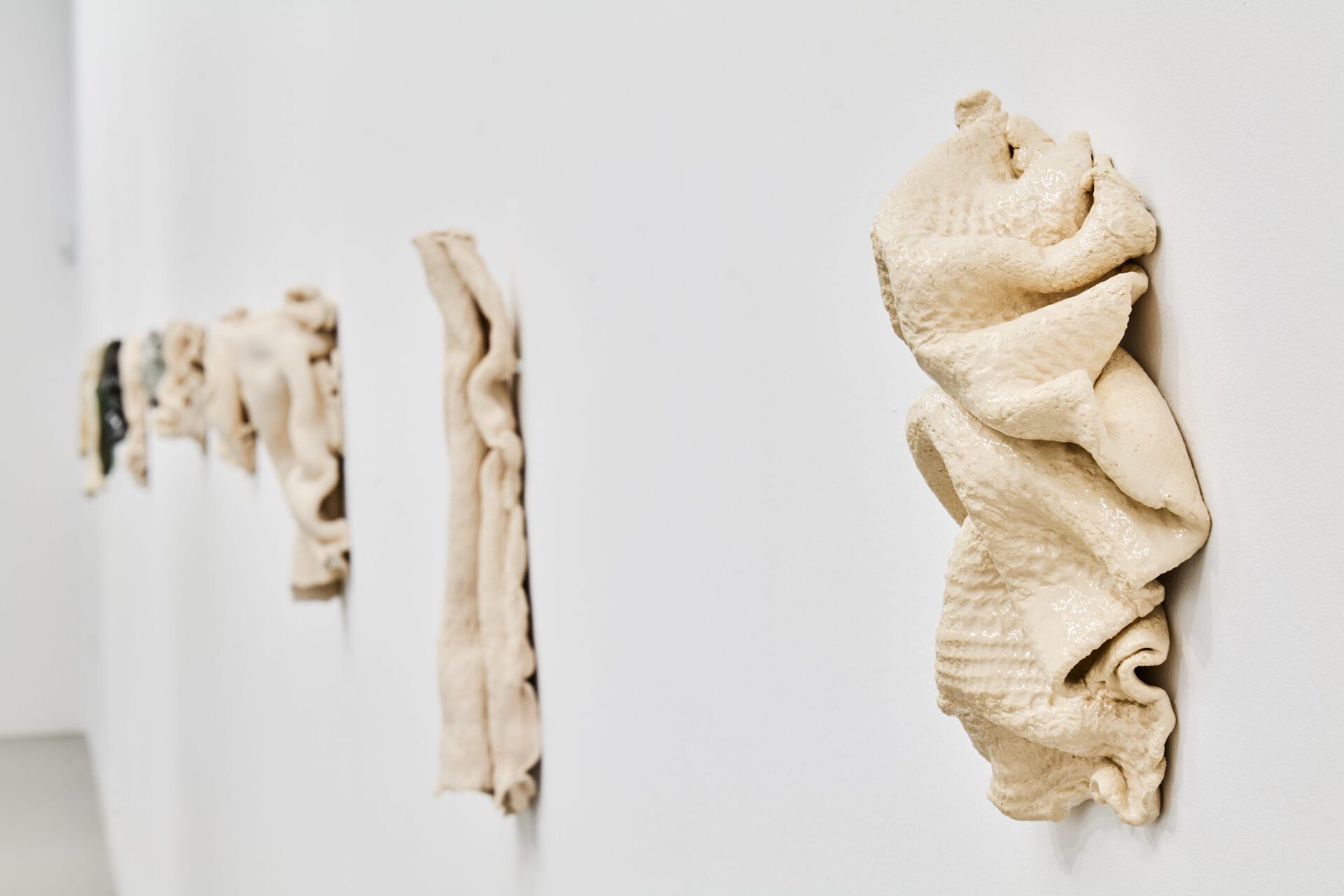
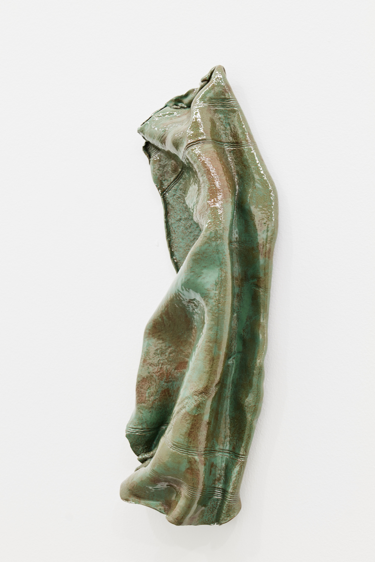
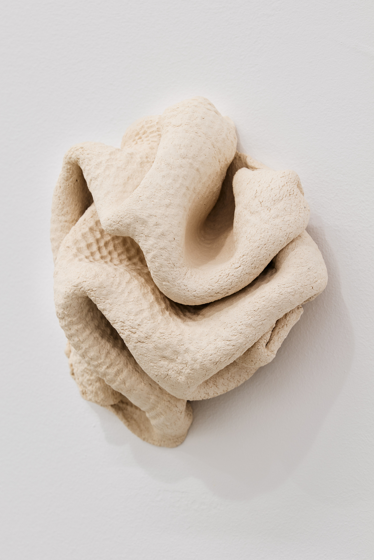
In the 12-part series "Frottee", the depicted objects also change their ordinary state, their haptics. A moment of irritation arises when the soft-looking objects turn out to be fired in ceramics. For the series, the artist pressed ordinary dish towels and terry towels into wet ceramic mass, so that their woven surface structures remained in the mass. Berchtold then shaped the negative of the textile by hand into manneristically sinuous objects that often evoke associations with natural objects such as flowers, snails, or vulvae. Her surfaces always show the textile structures of the towels. Despite the indexicality of the surface (pushing off and in of the towel), the "Frottee" series is estranged from its origin. This is because Berchtold has dyed and glazed objects in the series such as "ridin' dirty", "croco", and "Frottee 2". The glossy colors emphasize the solidification and objecthood of the formerly mobile textiles. Like "tears of tin (dry a.f.)", the colored objects of "Frotee" in particular have different consistencies than initially suspected. They transform their usual properties.
III Permeability
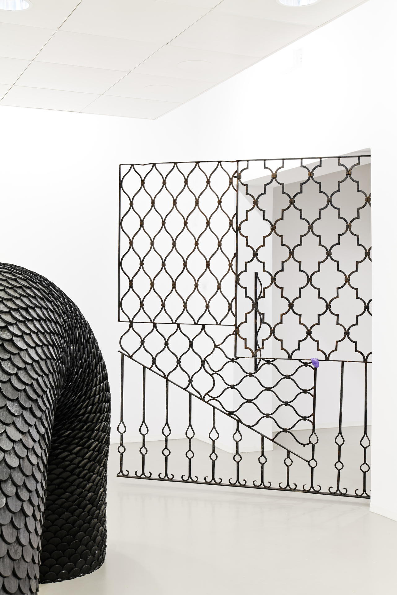
Thick skin - where are inside and outside? What and who stays outside or comes in? Permeable and repellent like the skin is the site-specific work "bouncer" that marks the entrance to the show. Iron window bars, which the artist found as objets trouvés and reassembled, initially shield visitors from the exhibition space, but already allow insights through the bars. "bouncer" also invites visitors to interact. If "Dicke Haut" wants to be entered, the skin of the "bouncer" must first become physically (not just visually) permeable, the gate must be pushed open. The "bouncer" describes the threshold to the exhibition, which is functional in both directions: it lets people in, it locks them in, and at the end it lets them out again.
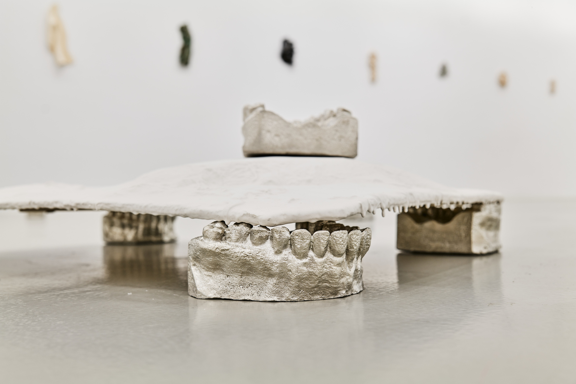
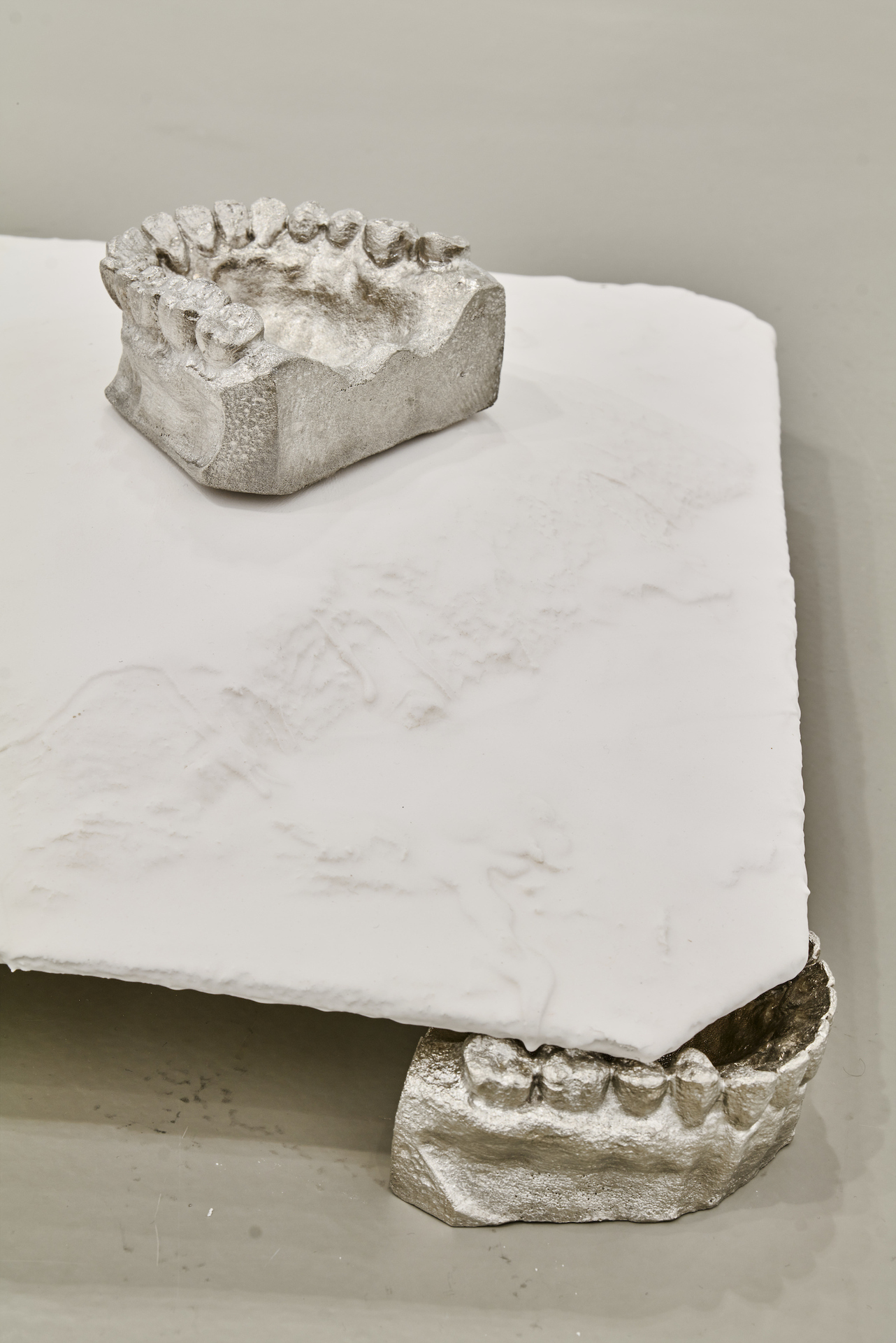
Similarly, the work "untitled bunch" installed on the floor evokes questions of belonging, of inside and outside. Using the word bunch, which describes a bundle, heap, or gang, the bits cast in pewter can be understood as a gathering. Ripped mouths, potentially chattering, talking, laughing, come together as a community. Thus, three dentures support a monochromatic white rectangular plaster plate on which two other upper jaws rest. One of them is placed at the edge, threatening to fall down. Outside the slab, scattered in the surrounding space, are three more pewter casts. Some seem to be facing the slab, one seems to be turning away. How do the casts relate to each other? And how to the plaster slab? Is it the site of their meeting?
IV Feeling
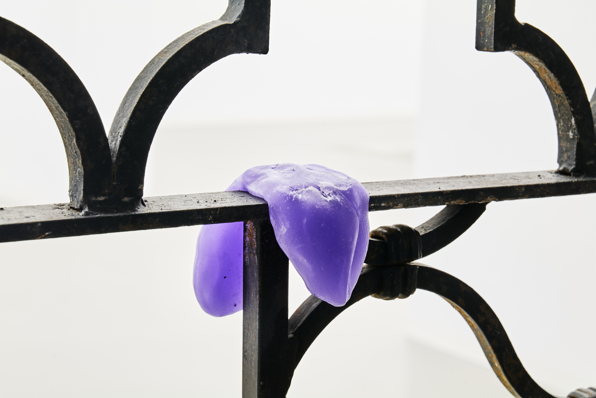
Ambivalent relationships are also created by the works in the exhibition in terms of the sensations they generate. Thus, "bouncer" evokes feelings of being locked up, "untitled creep" has a melancholic, even eerie effect due to its dark colors as well as its reptilian exterior. The mood continues through the pared-down colors of nearly all the works in the show. Most of the works are black, white, ocher, or gray. Only a few objects in the "Frottee" series Berchtold designs in a shade of green. Next to them are the rich green of leather or a violet wax that the artist put around a "bouncer"'s lattice bar. The wax seems to push its way through the bars like a tongue. Does the gate stick its tongue out at the visitors because they (don't) get an entrance?
In addition to detailed elements, Berchtold - in a long art-historical tradition - plays with their titles in almost all of her works. (4) Thus the mournful, heavy impression of "tears of tin (dry a.f.)" is humored by the addition of 'dry as fuck'. The abbreviation, which originates from youth and internet language, invalidates on a content level (dry), but also on a formal level (a.f.), the painful effect that tears can have.
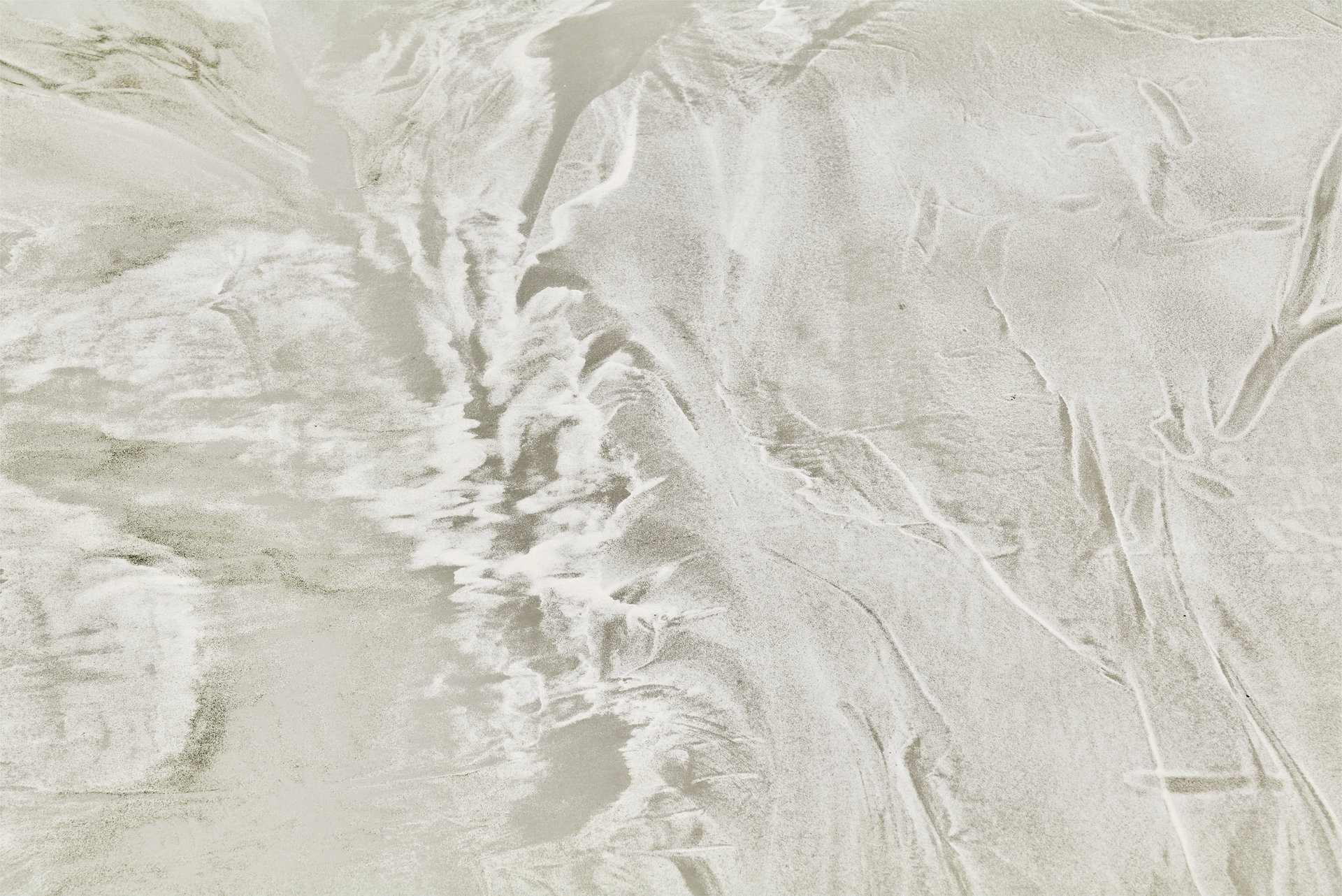
"flat sand land" shares its name with the satirical novella "Flatland", written by Edwin Abbott in 1884 about an imagined world in two dimensions. (5) Abbott’s completely flat imagined world pointed out all the social characteristics of Victorian England in an exaggerated way. Admittedly, the patterns of flat sand land are not images of this historical epoch. But the sand installation takes on a new level of meaning through its reference to flat land: what structures do we recognize in the scattered sand? What does this recognition say about us and our social practices?
Berchtold also deliberately uses cheeky and humorous titles for the "Frottee" series. "Meister Propper", "Feuchter Furz" or "ridin' dirty" are tongue-in-cheek reminders of where the surface structures of the ceramic sculptures come from: From textiles of the private household and personal hygiene. However, instead of including the toil and social devaluation that often accompany unpaid household chores in the titles of the works, Berchtold gives them a playful lightness. "sorry to be real", the dirt that we ourselves have created ironically apologizes to us. "Sorry not sorry", he might also say.
(1) Byung-Chul Han: The Salvation of the Beautiful, S. Fischer Verlag Frankfurt am Main 2015, p. 25
(2) In addition to modernist monochrome painting, the examination of the image carrier is an important art historical reference point. One thinks of artists like Blinky Palermo, who had his stretcher frames covered with industrially produced fabrics, or of the feminist artist Rosemarie Trockel, who used coarsely woven materials.
(3) The use of leather also plays with the impression of disgust, death and dying. The use of animal products always includes a hierarchical human-animal relationship.
(4) Ironic work titles that contained language games or other quibbles were introduced by Marcel Duchamp. The interest of 1960s and 1970s art, which regarded the picture title as an immanent part of the artwork and helped to shape it, was also in his tradition.
(5) Edwin A. Abbott, Flatland. An Edition with Notes and Commentary by William F. Lindgren and Thomas F. Banchoff, Cambridge University Press 2010, p. 34
Luka Jana Berchtold (*1990, Schwarzenberg / Vorarlberg) studied sculpture at the Academy of Fine Arts Vienna, as well as transmedia art at the University of Applied Arts Vienna.
Exhibitions (among others): CHAMBRE D'AMI-XES (Vienna), Künstlerhaus Palais Thurn und Taxis (Bregenz), DWDS (Bregenz), VIENNA ART WEEK (virtual showroom), Art Bodensee (Dornbirn), LLLLLLl (Vienna), Angelika Kauffmann Museum (Schwarzenberg), SOHO Ottakring (Vienna), fwp 13/kunstakt (Vienna), curated by (Vienna).
Johanna Luisa Müller