
Rahel Pötsch
orange watch
Project Info
- 💙 artothek Köln
- 💚 Astrid Bardenheuer
- 🖤 Rahel Pötsch
- 💜 Astrid Bardenheuer
- 💛 Mareike Tocha
Share on
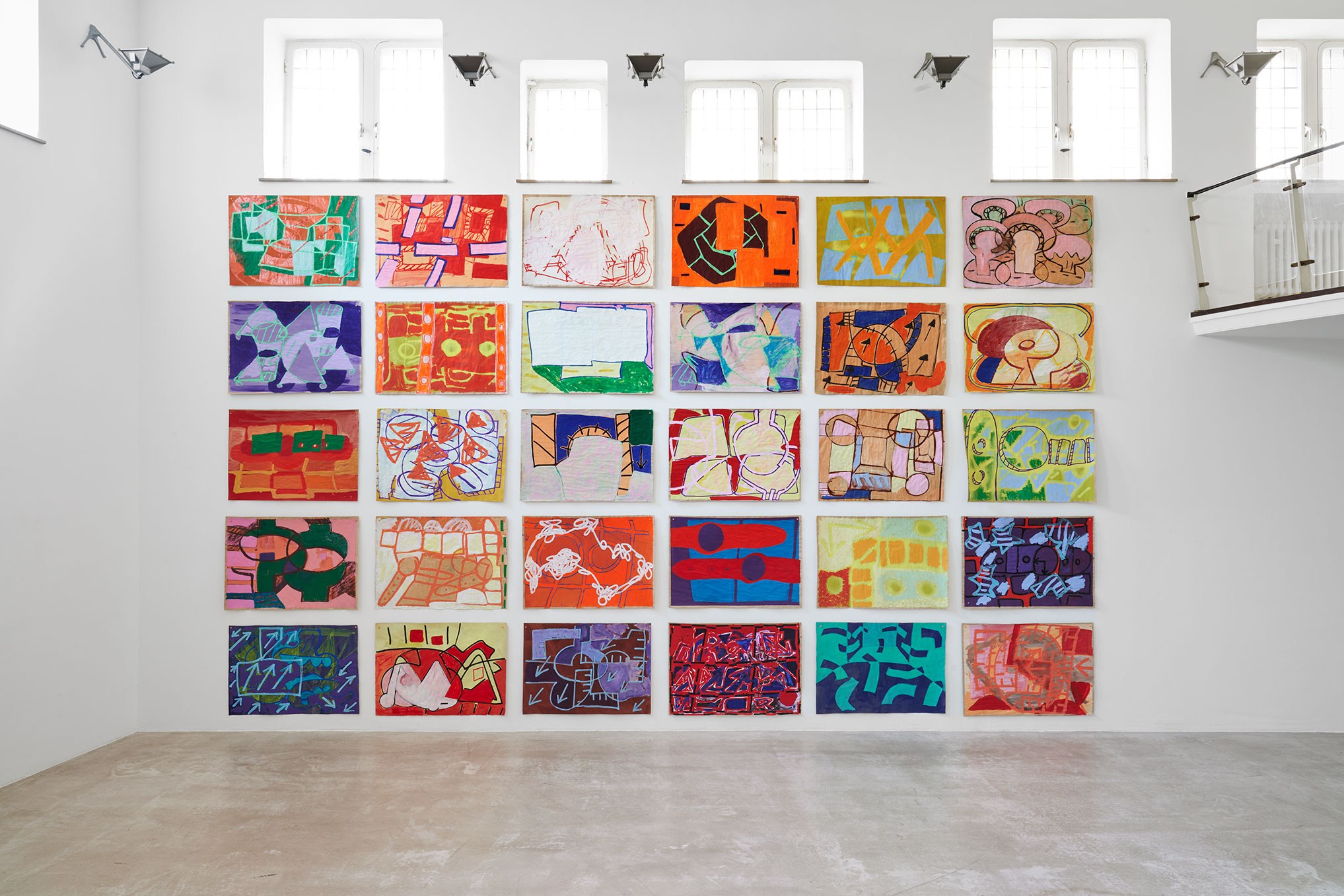
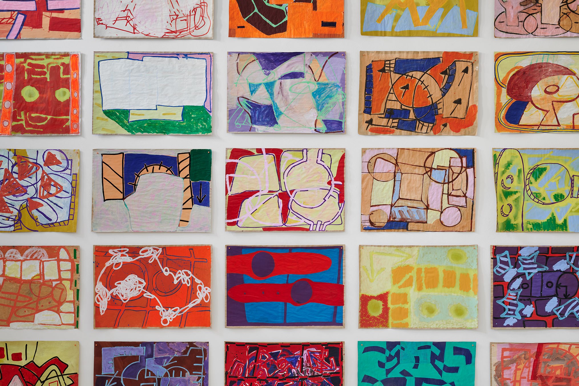
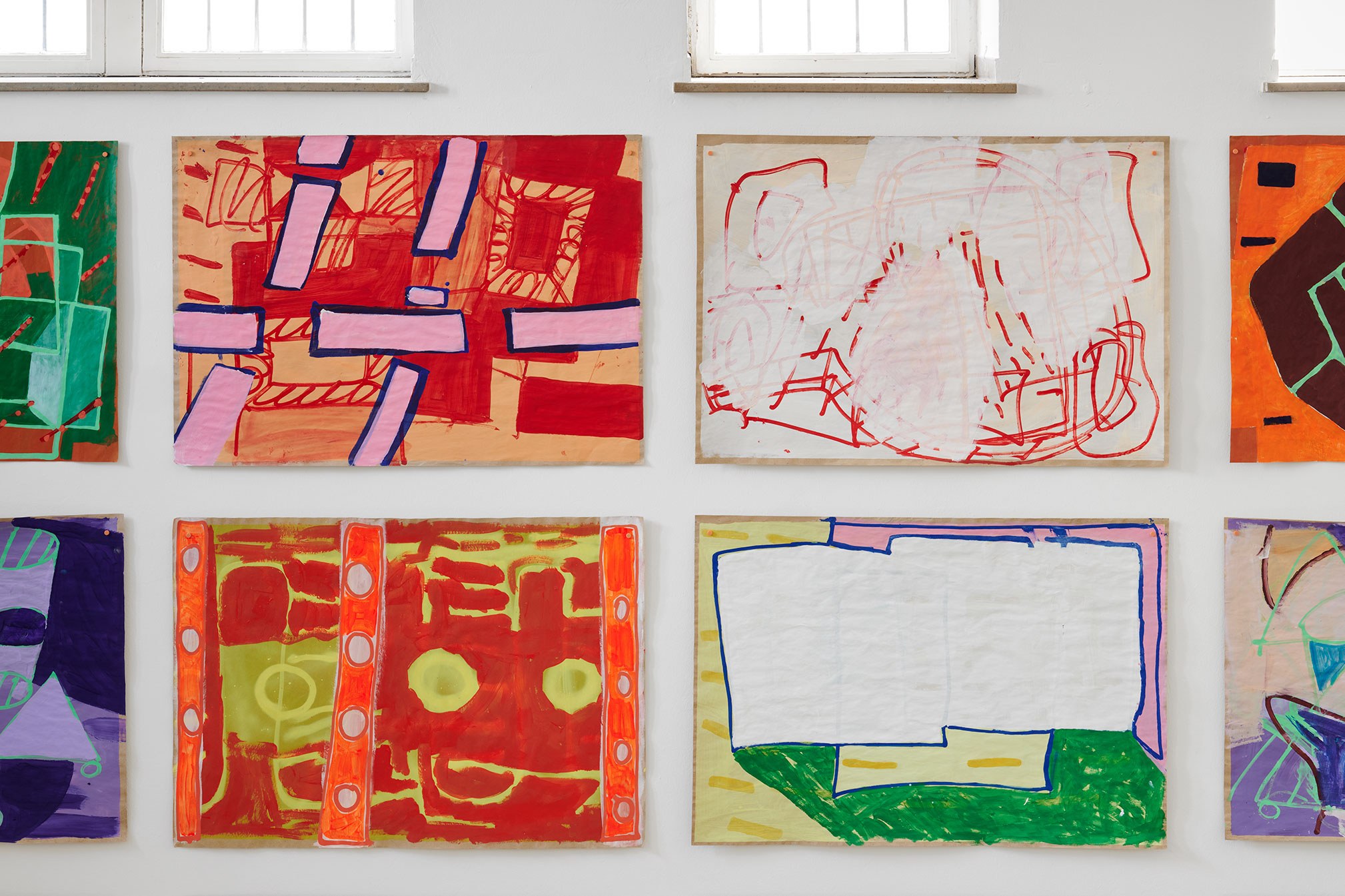
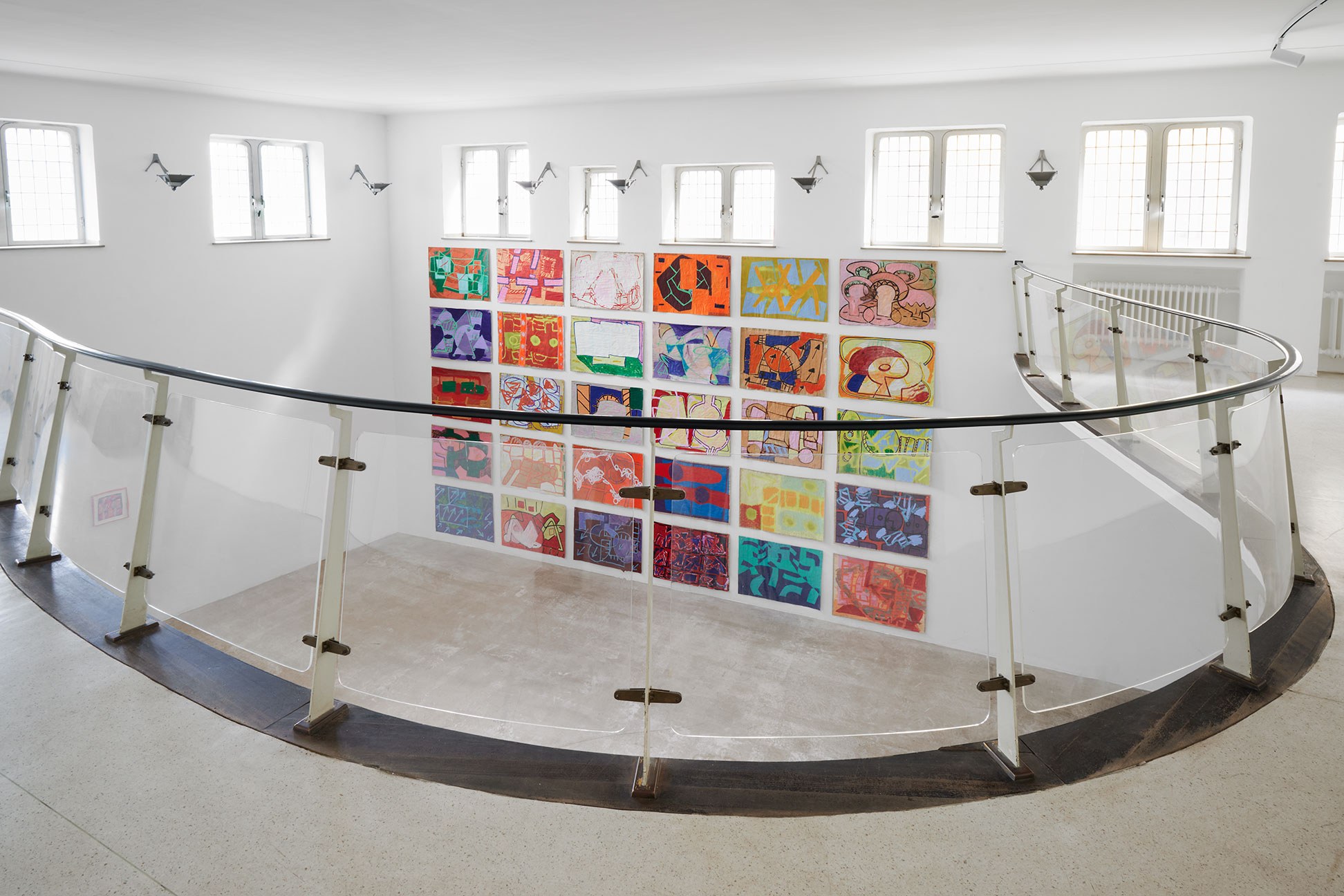
30 paintings on paper; 100 x 70 cm; acrylic, spray paint, marker
Advertisement


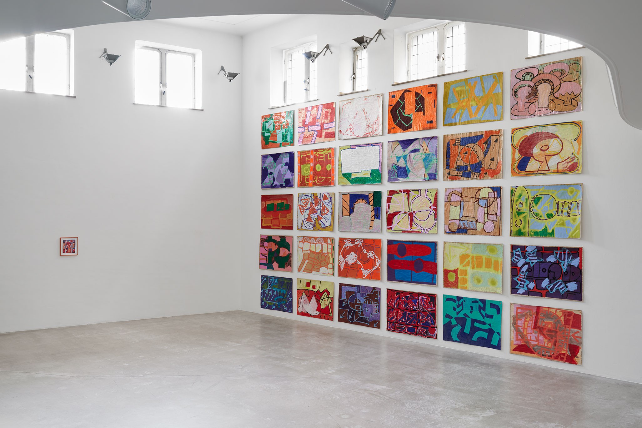
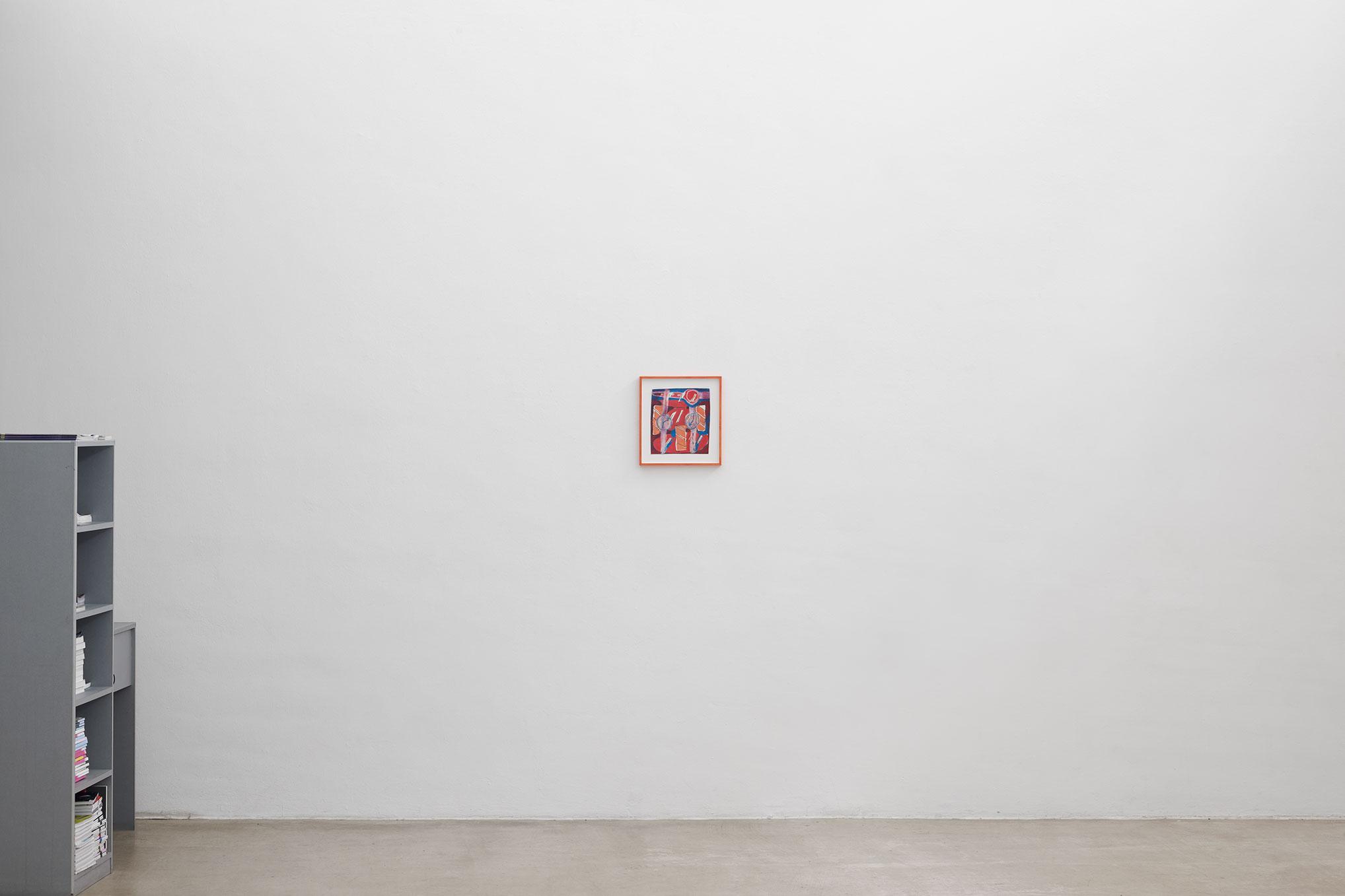
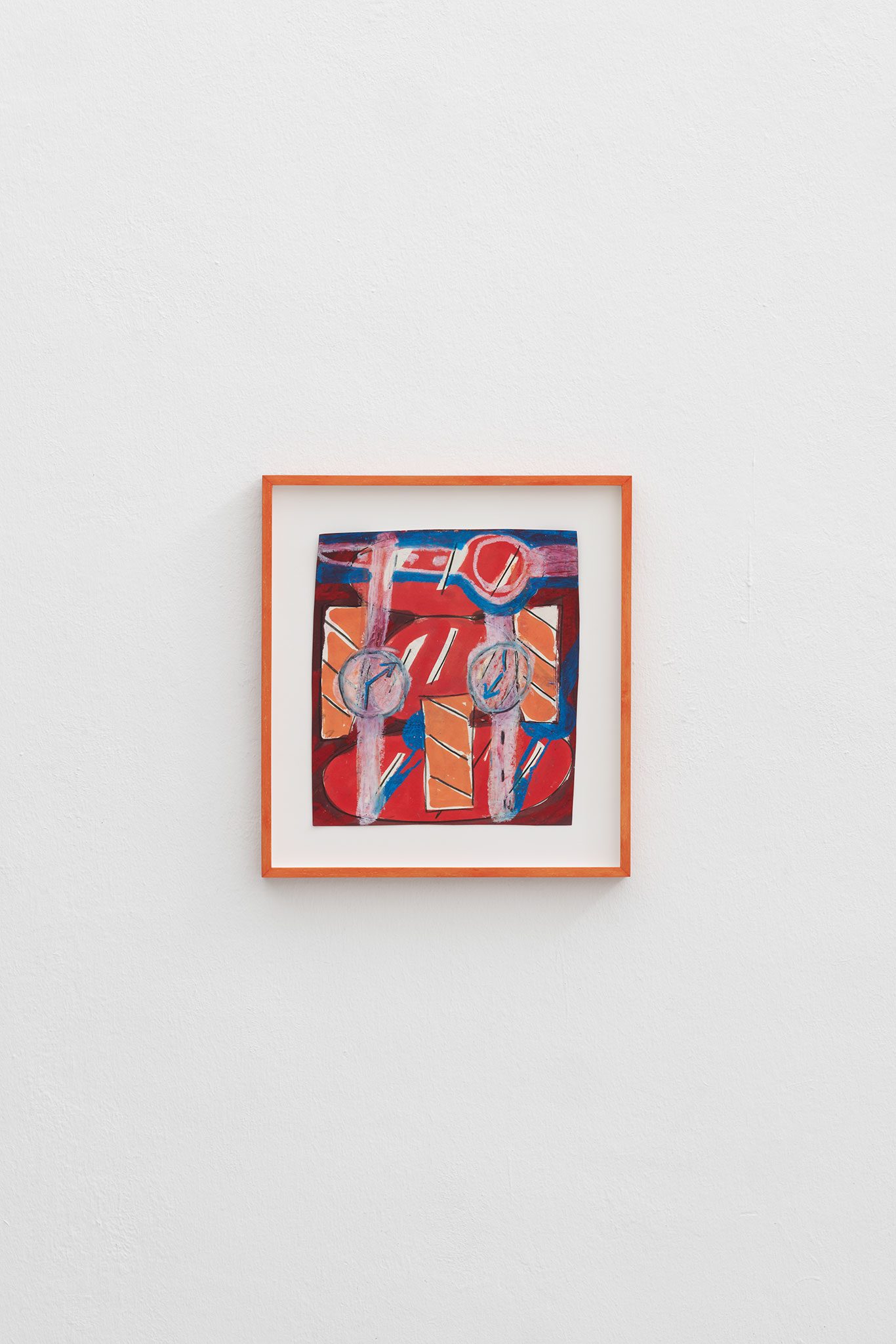
framed drawing; title: " orange watch"; 22 x 23 cm; water colour, pencil, crayon
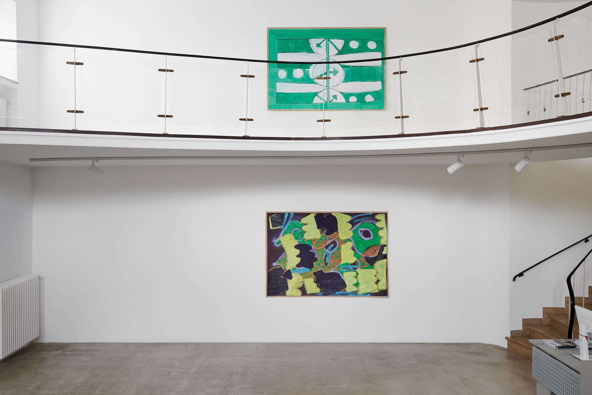
2 paintings on paper; no titles; 140 x 200 cm; acrylic, charcoal, spray paint
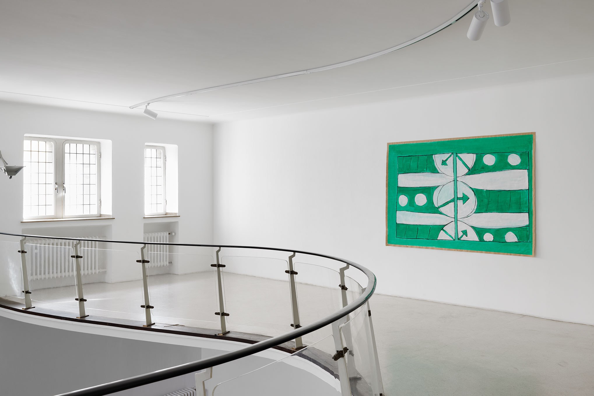
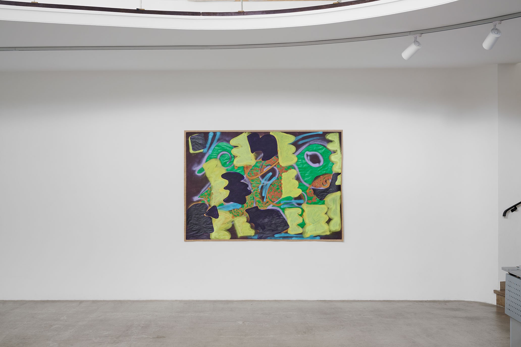
In her works, Rahel Pötsch combines painting with paper cuts, performance and video to create opulent works of art overflowing with shapes and colours. They often look like spatial stagings whose formal vocabulary is drawn from her physical movements and often borrowed from floral motifs.
Rahel Pötsch has developed the exhibition ‘orange watch’ for the artothek, in which she shows a group of paintings on paper. While painting and its expansion into painting performance have previously culminated in stop-motion video works, in Cologne she has reduced her range of action to the classic ‘panel painting’. She still remains true to her typical working materials: acrylic colours, markers and spray paints on robust kraft paper form the basis for her play with space and surface, with figuration and abstraction. Layer by layer, the artist develops illusionistic spaces in bright colours in her paintings and breaks up their effect by overpainting them with flat, pattern-like forms. Previous stages of the painting still appear in some places or are hidden behind transparent areas of colour. The painting process is not staged as an act, but can still be traced within the picture.
In a 30-piece block hanging, viewers are no longer prescribed the speed and rhythm by the timing of the video editing at which the images must be read. Instead, the group of paintings can be explored at the viewer's own pace. Their individual references and preferences characterise the course of the viewing. Nevertheless, overpainted fragments and the abundance of images as an analogy to film frames refer to time-based work.
In the strict block hanging, contexts that are otherwise provided in the film are created here by the audience itself.
The connection to time is part of the exhibition title. As an overarching theme,‘orange watch’ is quoted in individual pictures, sometimes ironically, through watch motifs. The wristwatch is the timepiece that sets the pace, constantly perceptible and audible to the wearer as a basic pulse.
At the same time, the concept of time plays a role in the painterly production insofar as the artist draws on her pictorial memories to create new expressions which, when viewed in the future, still have a relevance to the then current contexts or, conversely, allow from the future a view on past pictorial statements. Painting works as a visual container for time. The combination of painting with time and sound, which form a unity in Rahel Pötsch's videos, can be experienced here between the pictorial units as a polyphonic choir.
At the same time the title with the double meaning of the English word ‘watch’, reminds us of the possibility of long-term and concentrated observation and the experience of this visualised temporality. An experiment that takes the artist and audience back to the origins of visual perception.
Astrid Bardenheuer


